African American women on the steps of a building at Atlanta University, 1899 or 1900. Photo by Thomas E. Askew (Du Bois archive, Library of Congress)
Two weeks ago ( I know, that's a bout a decade in internet time), I posted the awesome charts that W. E. B. Du Bois and his students at Atlanta University produced for the Paris Exposition in 1900. I still haven’t quite processed the overwhelming response to this work. Not only has the massive amount of tweeting and reblogging, sent my page views through the roof, but the charts have gotten attention way beyond the infographic and design communities. They have been posted on political blogs and have sparked some lively debate.
So if you were one of the scores of viewers smitten by these infographics, know that you were/are not alone. And much thanks to all who passed them along. The networked enthusiasm created so much visibility for the Du Bois chart, that John Pavlus of Fast Company featured them on FastCo Design as Infographic of the Day. They were also posted by David McCandless as Vintage Infoporn on Information is Beautiful.

Here are some highlights from the bloggesphere:
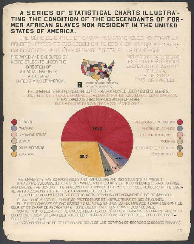
Adam Serwer of the Prospect observes that “…you can get a hint from this of the days when teachers at black schools were among the best in the country -- Jim Crow was funneling the most educated black minds into a very limited set of professions.
Yglesias of Think Progress picks up from Serwer, “As you can see here, a staggeringly high proportion of Atlanta University graduates were becoming teachers… This and the parallel set of facts for women is, I think, an unduly neglected trend in recent American life. A related point is that you tended to see relatively high-performing K-12 education systems in Communist countries. Jim Crow, patriarchy, and the economic policies of Fidel Castro are all ways to artificially increase the appeal of a teaching career relative to other options … When teaching was the only thing many classes of smart ambitious people could do, it was easier to run a high-performing school. 33 comments followed that post.
Derek Attig at HASTAC considers the display of these charts in Paris, a political act. For him, they were more proof of “…how important circulating information transnationally could be for civil rights struggles. As Ida B. Wells had demonstrated just seven years earlier, with her anti-lynching speaking tours of Britain [PDF], getting information out of the South, and indeed, out of the United States, could be a vital part of such campaigns. (Abolitionists in the antebellum period frequently made similar transatlantic tours, as well.) …
Given the language-barrier problems that could confront Americans at a global exposition in Paris, the highly graphic (and lightly textual) nature of so many of the posters indicates some careful thought about the politics of communicating information and capturing attention, which are so central to freedom struggles of all kinds.”
Jacob Alonso, of Seeing Complexity, also sees visualizing information as a political act: “Du Bois’ students made a radical decision when they visualized the economic plight of a group explicitly excluded from statistical analysis and thus hidden from international attention. …the simple act of disseminating information can, in itself, be a radical and potentially transformative act.”
And then there was the ultimate indication of how important these charts are—an anonymous reader commented that the graphics were obvious fakes!