Popular Post
Showing posts with label vintage graphic. Show all posts

Brimfield Blues


I have to believe that at some point during the Brimfield antique show's 50-year history, some dejected dealer, picking away at an unsold Gibson, came up with the Brimfield Blues. I’m imagining that it was in the 95-degree heat of July, or a solid week of rain. One thing I can say for sure, though, is that it was not written nor sung this year. I’ve never seen a happier bunch of dealers than the vendors at Brimfield last week. I’d say the report on sales ranged from happy to delirious. That’s how good business was—even after one day. I’m sure there’s a economic indicator in there somewhere …

But back to blue. My first treat of the day was waiting for me in the bushes right outside the front door. Four exquisite robin’s eggs, in an expertly crafted nest. Consummate perfection is definitely a good way to start the day.

We stopped at the Sturbridge Coffee House for refueling, and were greeted by this fabulous Plymouth Fury parked right in front. By the way they have very delicious muffin tops and a sign at the counter poses the question, "What's Your Cup Size?"
It was when I watched Terry get out of the car in her cerulean parka, that I realized there was a definite blue thing going on.
Here’s how the theme played out the rest of the day…

Roof level of a multistory toy parking garage


Aren’t these incredible? They were rescued from an old house in Massachusetts and were at the same Antique Therapy booth I wrote about the other day. So far, I haven’t been able to find anything about the Armand Art Studio of Detroit.

Blue eyeshadow--just the right accent for a pink cat. Don't you think?

Artist, Terry Rosen, was scouring Brimfield for vintage New England ephemera. When she hunts, she doesn’t just look on the tables, she looks under the tables. Which is a good thing because her eagle eye spotted this flea market equivalent of “today’s news, tomorrow’s fish wrap.”

Du Bois Charts: Twittered, Tumbld, Stumbled, fffound

African American women on the steps of a building at Atlanta University, 1899 or 1900. Photo by Thomas E. Askew (Du Bois archive, Library of Congress)

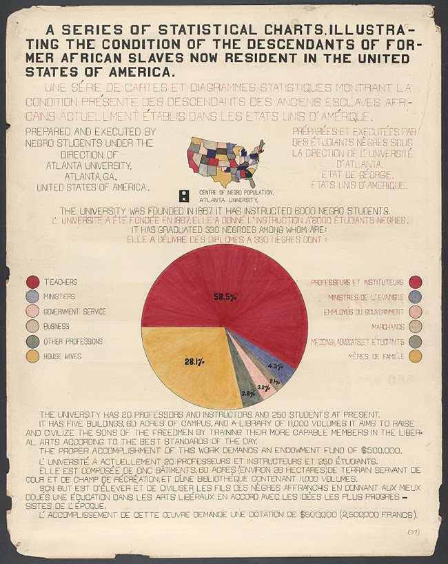
Two weeks ago ( I know, that's a bout a decade in internet time), I posted the awesome charts that W. E. B. Du Bois and his students at Atlanta University produced for the Paris Exposition in 1900. I still haven’t quite processed the overwhelming response to this work. Not only has the massive amount of tweeting and reblogging, sent my page views through the roof, but the charts have gotten attention way beyond the infographic and design communities. They have been posted on political blogs and have sparked some lively debate.

So if you were one of the scores of viewers smitten by these infographics, know that you were/are not alone. And much thanks to all who passed them along. The networked enthusiasm created so much visibility for the Du Bois chart, that John Pavlus of Fast Company featured them on FastCo Design as Infographic of the Day. They were also posted by David McCandless as Vintage Infoporn on Information is Beautiful.


Here are some highlights from the bloggesphere:

Adam Serwer of the Prospect observes that “…you can get a hint from this of the days when teachers at black schools were among the best in the country -- Jim Crow was funneling the most educated black minds into a very limited set of professions.

Yglesias of Think Progress picks up from Serwer, “As you can see here, a staggeringly high proportion of Atlanta University graduates were becoming teachers… This and the parallel set of facts for women is, I think, an unduly neglected trend in recent American life. A related point is that you tended to see relatively high-performing K-12 education systems in Communist countries. Jim Crow, patriarchy, and the economic policies of Fidel Castro are all ways to artificially increase the appeal of a teaching career relative to other options … When teaching was the only thing many classes of smart ambitious people could do, it was easier to run a high-performing school. 33 comments followed that post.

Derek Attig at HASTAC considers the display of these charts in Paris, a political act. For him, they were more proof of “…how important circulating information transnationally could be for civil rights struggles. As Ida B. Wells had demonstrated just seven years earlier, with her anti-lynching speaking tours of Britain [PDF], getting information out of the South, and indeed, out of the United States, could be a vital part of such campaigns. (Abolitionists in the antebellum period frequently made similar transatlantic tours, as well.) …

Given the language-barrier problems that could confront Americans at a global exposition in Paris, the highly graphic (and lightly textual) nature of so many of the posters indicates some careful thought about the politics of communicating information and capturing attention, which are so central to freedom struggles of all kinds.”

Jacob Alonso, of Seeing Complexity, also sees visualizing information as a political act: “Du Bois’ students made a radical decision when they visualized the economic plight of a group explicitly excluded from statistical analysis and thus hidden from international attention. …the simple act of disseminating information can, in itself, be a radical and potentially transformative act.”


And then there was the ultimate indication of how important these charts are—an anonymous reader commented that the graphics were obvious fakes!

Black History Charts, 1900


The stunning charts you see here were hand drawn and colored at the turn of the 19th century, by Sociology students at Atlanta University (now Clark Atlanta University). Their professor at the time, African American activist W.E.B. Du Bois, was organizing the upcoming “American Negro” exhibit for the 1900 Exposition Universelle in Paris.

Over 60 charts and maps, along with specially commissioned photographs were prepared for The Georgia Negro Exhibit, which was part of the larger display. Only three of these infographics are available in color from the Library of Congress. Click on them to view them larger. There are black and white reproductions of the entire group (see selection below), at the extensive online archive created by Professor Eugene F. Provenzo, Jr., of the University of Miami. There, you will find an enormous amount of information and visual material pertaining to this important historic exhibit.


The following excerpts from Professor Provenzo’s site offer more detail about the information graphics.
Du Boise described the project in his autobiography:
In 1900 came a significant occurrence which not until lately have I set in its proper place in my life. I had been for over nine years studying the American Negro problem. The result had been significant because of its unusual nature and not for its positive accomplishment. I wanted to set down its aim and method in some outstanding way which would bring my work to the notice of the thinking world. The great World's Fair at Paris was being planned and I thought I might put my findings into plans, charts and figures, so one might see what we were trying to accomplish. I got a couple of my best students and put a series of facts into charts: the size and growth of the Negro American group; its division by age and sex; its distribution, education and occupations; its books and periodicals. We made a most interesting set of drawings, limned on pasteboard cards about a yard square and mounted on a number of moveable standards.

From an official report provided to the Exposition:
Finally should be mentioned the results of the special studies carried out by Professor Du Bois. These consisted of a series of charts showing the condition of the colored race in the State of Georgia. This State was selected as being the one with the largest negro population. These charts showed first the general distribution of the negro race in all parts of the world, then the distribution in the United States by States, and finally the conditions in Georgia in great detail. These latter charts indicated the growth of the negro population in the State by decades; its relative increase in comparison with that of the white race; migration to and from the State; the distribution of the negroes according to age, sex, and conjugal condition; the occupations of the negroes; the number who could read and write; the value of the property owned by negroes; the number of acres owned by them or being cultivated by them as owners or tenants; the value of farm implements, horses, and stock owned, etc.

The variety and inventiveness of charting devices used, is quite impressive, especially for undergraduate Sociology students in 1900. Unfortunately, the quality of reproduction is not very good. I’ve uploaded the files here, as I found them. Some will enlarge when clicked, and some won’t. Once again, to view the entire series go here.


PSSSSSST!

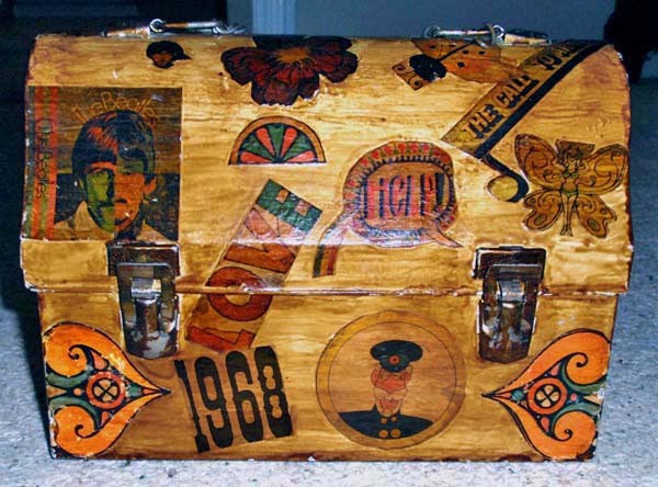
If, in the year 1968, you were not a preteen girl fully immersed in the study of grooming products and all things mod, you are excused for not knowing about the amazing nonwater shampoo-substitute that came in a can.

Yes, PSSSSSST was a powder-based spray to be used when you just didn’t have time to wash your hair, and then roll it around a giant coffee can to dry it straight.

What I could not have known then, was how perfect it would be to immortalized a bit of PSSSSSST advertising (along with all things Beatles or ladybug) on yet another iconic fad of the day—a decoupaged lunch-box handbag.
I’ve read that, like numerous other products of days gone by, the dry shampoo has been re-introduced! "Between Shampoos- On Camping Trips- After Sports. Any time you can't use water. Psssssst is the convenient, quick fresher-upper for your hair."


Yup, that's Susan Dey, "washing" her hair. I found this image at Gold Country Girls.

My mom has sold her house and is moving to an apartment. I’ll be posting more nostalgia as the excavating and purging continues.

Fortune's 1934 Map of Italy


Today’s 'Cover of the Day’ over at Vintage Fortune Magazine is the special issue on Italy and Fascism published in July 1934. But that's not all. VFM’s Linda Rubes posts yet another cover today—the REJECTED one that was first created by illustrator Antonio Petruccelli. Read about that here.

What a perfect opportunity for me to share the fabulous map by L.H. Appleton that ran inside that issue. The map is printed double truck, sideways and uses three colors and black.

Now keep in mind that the size of the magazine was 11”x14”, so the full spread (22” x14”) accommodated an incredible amount of description. Clicking on this map will make it bigger, but really not big enough to read clearly. In order to really read the text you need to see the image at full size. (Another reason for me to get back to writing that book about Fortune’s glorious graphic past—wouldn’t it be awesome to see this reproduced at its original size?)

There are two details you can still make out at this size. One is the little black hand representing the Mafia to left of Sicily, and the other is the mileage scale, bottom right, which has to be one of the best mileage scales ever. To show the width of Italy, Appleton gives us a map of Connecticut indicating that it is 68 miles wide. Now if you consider that Fortune’s subscribers at the time, were wealthy businessmen, the size of Connecticut was probably familiar to most of them!

I promise to run more of Fortune’s amazing infographics very soon.

The Art on Their Sleeves: Vintage 45s

I’m just crazy about these Czechoslovakian 45 record sleeves. These first four, by Opus, manage to be fresh and mod, but also sophisticated in use of color and restraint of design. I particularly like them as a set.


The Opus set, along with the next six sleeves, are from a site devoted the musical career of Slovakian singer Tatiana Hubinska (1944-1999). She was popular during the 1960s and 70s was best know for the Slovak version of ‘Puppet on a String,’ and for her hits ‘Casanova’ and ‘Halo Baby, Halo Boy.’


Halo baby, haló boy (1965)

Puppet on a String (Ako malý psík,1967)


Curious to see what else was out there in foreign 45 record sleeves, I quickly came to a site called Record Envelope: The Little Library of Factory Sleeves. It is maintained by illustrator Kavel Rafferty, and folks from all over the world send her sleeves. She has them nicely categorized by music type, visual motif, etc. Plus there are a ton on flickr. Here is a tiny selection from other countries …

Poland


Sweden


Germany

Belgium

Britain

Netherlands

A-D, Cover by Paul Rand

My lucky week—I snagged this Feb-March, 1941 edition of A-D, An Intimate Journal For Art Directors, Production Managers, and their Associates, for $2.

Front Cover

Back Cover

Basketball Rules!

The diagram below, is on the back of the 1953 book below it. I don't really know if 'Basketball Rules' had a double meaning back then, but I’m pretty sure it was just the rules for playing basketball.